Colour Psychology In The Home
Posted by Victoria Yardley on

Everyone has a favourite colour, one that they feel particularly drawn to but the question is, why are we more drawn to certain colours than others? In this article we are going to be exploring the interesting topic of colour psychology and the power of colour when it comes to your mood, feelings and even behaviours. It's useful to have a good understanding of colour psychology, particularly if you are planning on redecorating the interiors of your home to make sure your home creates the ideal ambience to suit you.
What is colour psychology?
Colour psychology in the most simple terms is an area of colour theory that involves assigning emotional and psychological connotations to colours. Some of the meanings of colours and emotional effects are universal, but there are a few that can have different meanings from culture to culture. The concept of colour psychology has become increasingly popular in recent years as marketeers have begun applying the theory to marketing campaigns as a way of influencing a consumer's impression of a brand. It is also a common consideration of artists and home designers who want the colours they use to evoke a particular emotional response or psychological reaction.
How does colour psychology work?
Although perceptions of colour are somewhat subjective, some effects are the same across everybody. Some colours on the spectrum represent feelings of warmth, others represent happiness and some can create a feeling of trust or compassion. Here are some examples of colour psychology, we have included examples of both positive and negative attributes of each colour:
Red
Red is one of the most eye-catching colours and is associated with strong emotions, both positive and negative. Here at Victory Colours we are experts in all things colour, especially when it comes to design. Our rule of thumb for the colour red is to remember; a little goes a long way. There are some universal connotations when it comes to the colour red, however there are also some cultural ones too. For example, in China the colour red symbolises luck and happiness. On the other hand, in the middle-east the colour red evokes caution and danger.

Orange
Orange is often associated with autumn due to golden leaves falling and big orange pumpkins, as well as being associated with a season, the colour orange can evoke a variety of emotions too. The colour radiates warm and cosiness which may be why it is seen as a friendly colour.

Yellow
Yellow appeals to the creative left side of the brain. The colour represents new ideas, happiness and optimism and that makes it a great way to lift people's mood. Again, like red, we always recommend using a splash of this colour because too much yellow can cause feelings of nervousness and agitation, particularly amongst people who are already feeling stressed.

Green
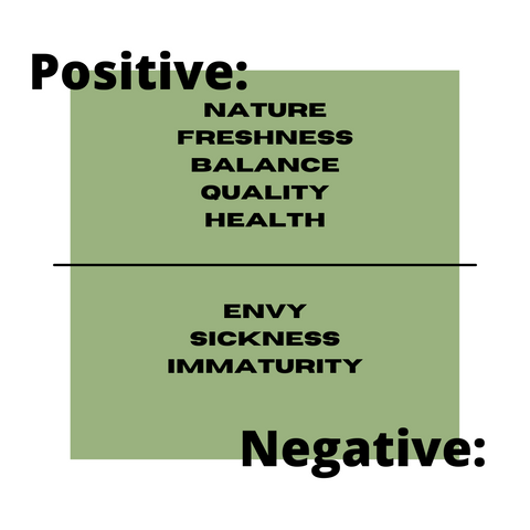
In terms of fashion, this year people have become completely obsessed with the colour green. This colour has two sides to it when it comes to evoking emotion, on the positive end of the spectrum, the colour green represents nature, freshness and balance. On the flipside though, it is important to remember that many people associate this colour with ‘envy’ which links to the saying ‘green with envy’. As well as this, people sometimes associate green with sickness because when feeling unwell your skin colour may go a pale green hue.
Blue
Blue has an opposite effect on the brain to the colour red. This is because blue is a calming colour that helps to reduce tension which may be why it is associated with peace. In general blue is said to be a trustful colour which is why it is popular in marketing as a way of building customer loyalty by appearing dependable and honest. Despite these positive connotations, blue is also associated with some negative ones including coldness and sadness, which may be related to people describing being sad as ‘feeling blue’.

Black
Black is becoming increasingly popular in interior design and when used correctly is a great way to create a sophisticated yet dramatic room. Paired with the right furniture, flooring and splashes of colour, a black feature wall can be a unique but aesthetically pleasing addition to any room. Although some people do associate the colour of black with death and formality, its quickly becoming a more popular colour with its versatility and sophistication.

White
White is a great colour when it comes to interior design because it's simple yet clean and can be paired with more or less any other colour or pattern. Its inoffensive and versatile yet too much of it can create a feeling of sterility making one feel isolated and cold. We suggest that when opting for white walls, be sure to include a dash of colour in your furniture and decor to add depth and personality to your room.

Overview of colour psychology in the home
Although colour can influence our feelings it's important to remember that these effects can vary from person to person, culture to culture and of course the situation. There is still plenty more research to be done on colour psychology in order for us to get a better understanding of the concept. In the meantime, we would love to find out more about your opinions on colour psychology, including what your favourite colour is and why and why certain colours make you feel a certain way. Please let us know via our social media @victorycolours.
Thanks for taking the time to read, to view all of the colours demonstrated please check out our paints and visit our eco paint products page.